
#10 tips to beautifully Artscape your space
Art has the wonderful ability of making a space and creating conversation. Recently I collaborated with The Property Stylist, Becky Freeman, a styling pro and creative entrepreneur. We artscaped a beautiful residence in downtown Toronto and below we share our top #10 tips for ‘Artscaping’ a space (+ an accompanying video series coming soon!).
TIP #1 - Choose art that makes your heart sing and you’ll love & live with forever!
The beauty with art is it’s an investment you can take with you as you move, and can even grow in value over time. Spend as little or as much as you like the value doesn't need to affect the investment in your happiness scale.
Build a collection of works by artists who inspire you. One of the beautiful things about collecting art directly from its creator, is it comes with the added bonus of having a personal connection to the artist. Making your the value on your investment not just a monetary one!
One of my favourite things about social media is being able to learn and follow and watch artists in their practice & process. Learning about them and their passion makes an experience as an art collector all the more richer.
TIP #2 - Create A Vibe
Do you want your space to evoke a certain feeling? If you want to add a sense of calm to your bedroom or living spaces look to images or art pieces that have that effect on you. Maybe you want to inject an uplifting energetic vibe to your office? Then look for pieces that inspire or motivate you. Whatever you choose, make sure it makes you feel good in your home or space.
Mix it up instead of shooting for everything to match. Blending art mediums, artifacts and sculpture provides a sense of movement and exploration throughout a space.
TIP #3 - Proportion and scale
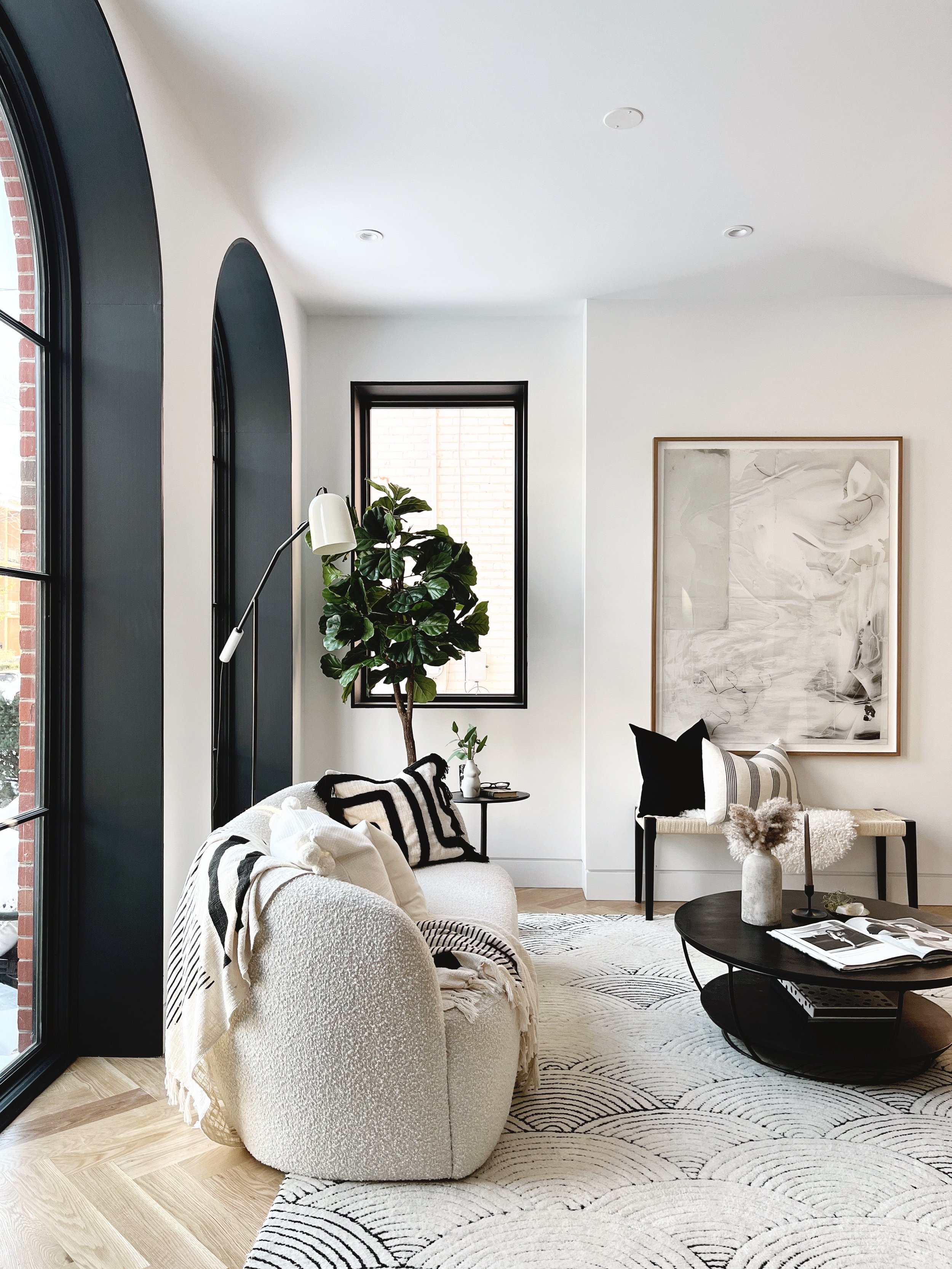
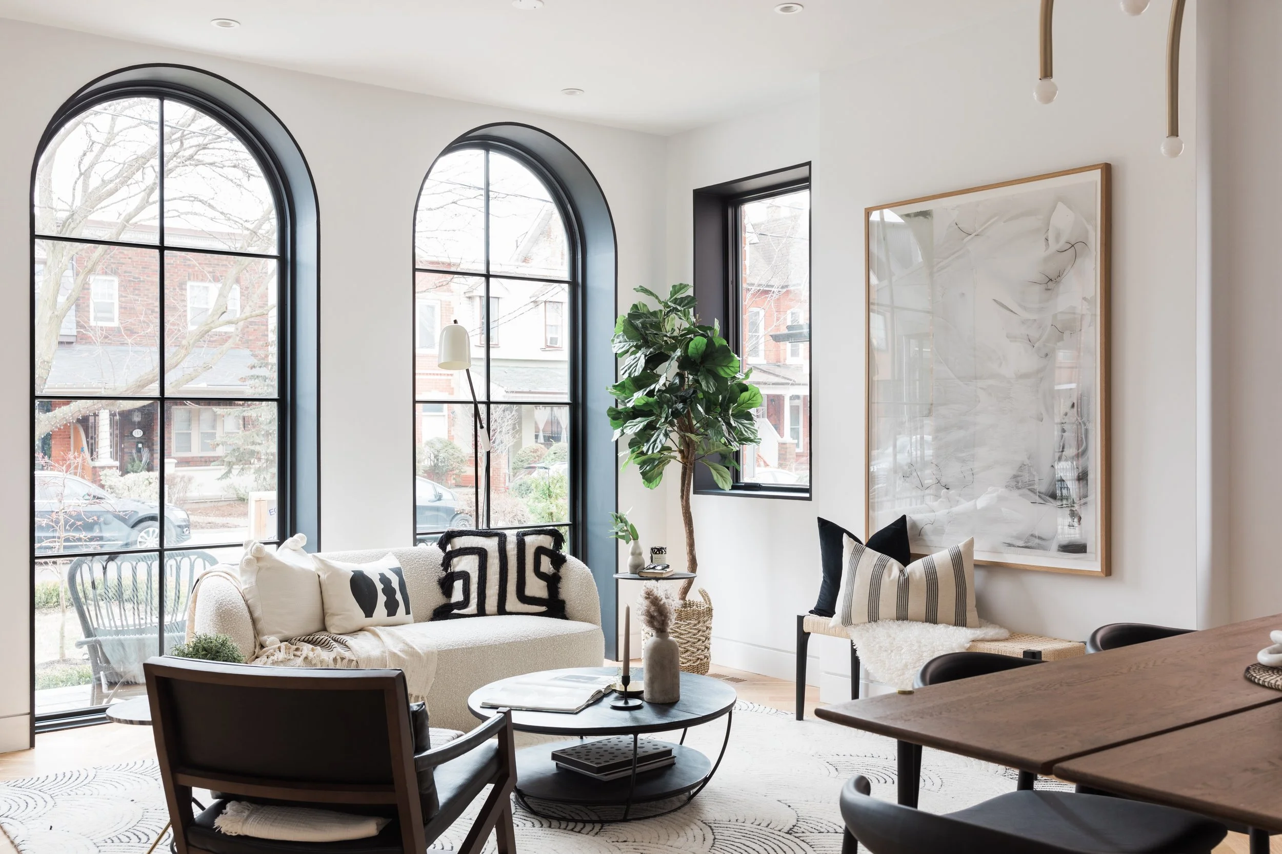
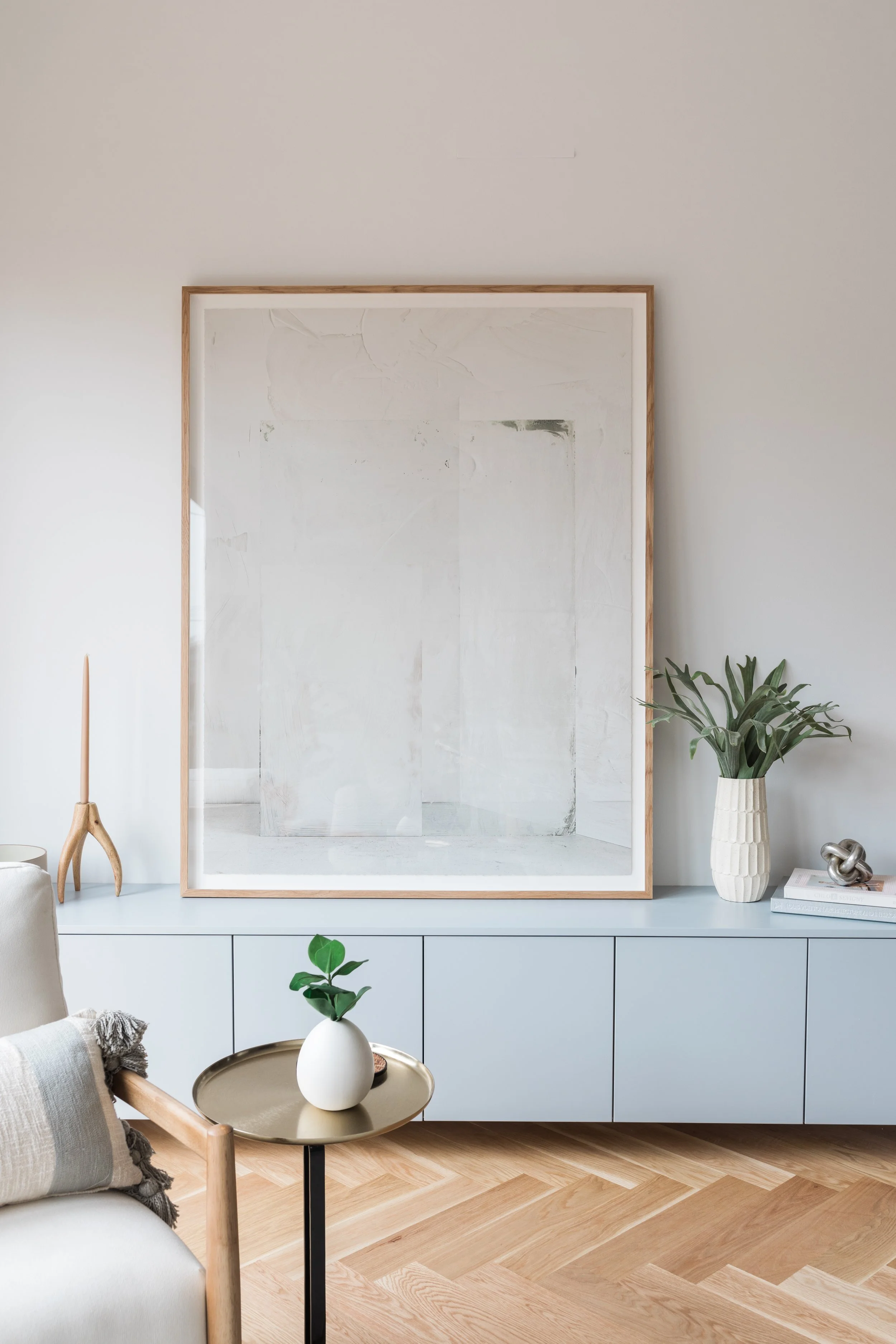
Proportion and scale are two key values to consider when choosing a piece for your walls. Err on the side of too large rather than too small. A too-small piece runs the risk of feeling out of place, like an afterthought, unless you are being intentional about it. If that’s the case, then by all means, break the rules!
Larger pieces can make a smaller room feel larger. Don’t be afraid to go big! In my opinion bigger is almost always better when it comes to art (if you have the space to do so, of course!)

TIP #4 - Measure you space
A great way to help visualize scale is by using painters tape to outline the Art’s Scale area, especially if you're buying online. Again, don’t skimp on art size. “I aim to fill at least 50 percent of the wall with art.
There is a semi-science to the art of getting the height of a piece just right—it's called measuring (!). You know the saying measure twice, cut once. The same rules apply to hanging art!
To be exact, the centre of a framed piece of artwork should be approx 57 -60 inches above the ground (that being the average human eye level, and the height galleries and museums use to decide where to hang pieces). Mark that height using a pencil, then measure to find the middle of the wall (from side to side), and mark where the two points meet. That's where the middle of your artwork should go! Now, measure the distance between the middle of the piece and where it will catch the nail (either where the wire hits when bent to bear weight, or where the saw tooth hanger is.
Measure that difference from your mid-point mark on the wall—that's where the nail (or picture hanger, or wall anchor, or brick clamp) goes.
If you're hanging a super-heavy piece, first use a stud-finder to locate a stud and see if it's in a logical location for your nail to go. If it is, hammer a big nail in and be done. If the stud is in a weird location, use the anchor-and-screw method instead: Drill a pilot-hole, tap the plastic anchor into it, then screw a screw into that, leaving it to protrude just enough that you can loop the wire or saw tooth right over it the same way you would with a nail. (Follow this link for more hanging tips)


TIP #5 - Consider the room you’re shopping for
Art has a way of finishing out a room. It can be the thing that ties it all together. So as you’re choosing your art consider these things—
• Think about the room you’re going to place the art in. Do you want it to blend in, or pop, have a calming value, be a conversation piece or just add to the layering and interest of the room’s decore?
• What are the colors that are in the room already? Do you want to highlight them?
• What mood are you trying to create in your space? Are you aiming for quirky or calming, fun, themed, pop-sentric, do you want your art to have any shock value or be classic?
If you have an existing artwork (or one in mind) you may like to use the Art as your anchor piece to inspire your interior design scheme.
TIP #6 - Choosing the art for a certain spaces
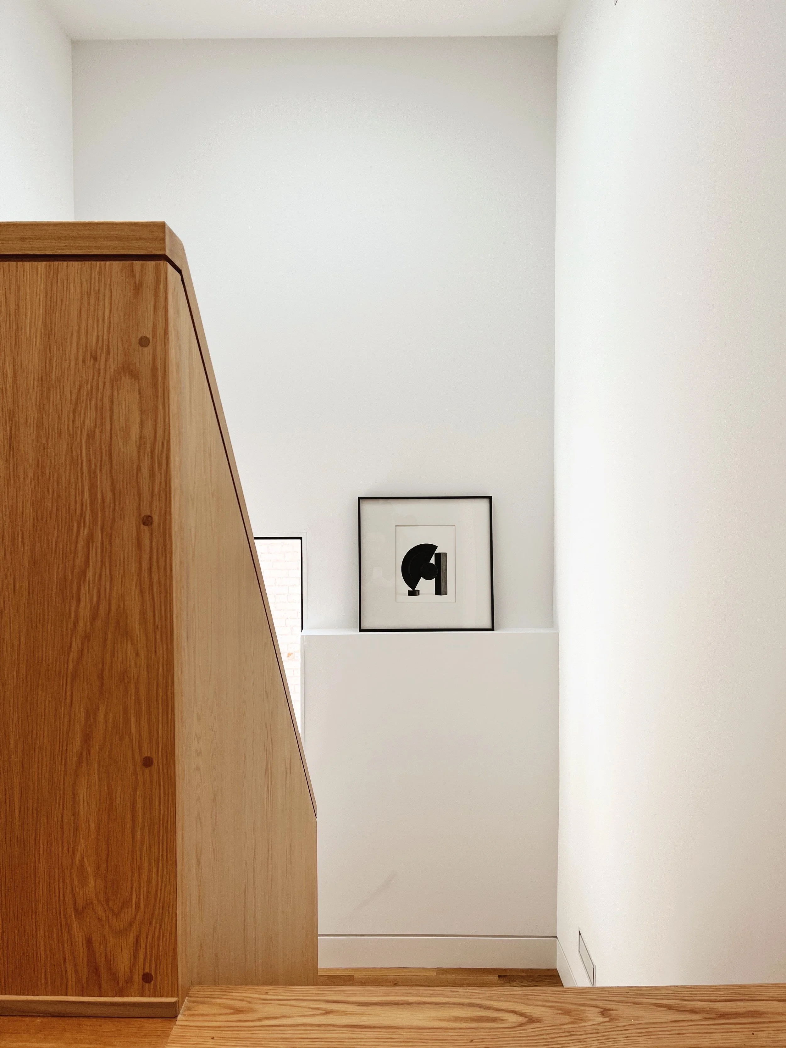
The kitchen is often referred to as the "heart of the home" and in many cases, the most used room of the house. There is no question, art needs to be incorporated here. Countertops or spaces above cabinets are perfect homes for another art inspired vignette. Consciously incorporate art into the details, lean smaller pieces that complement, not overwhelm, the space on a ledge or countertop.
The dining room
Make an impact in the dining room with larger works. A beautiful intriguing artwork can spark a great dinner conversation!

The bedroom
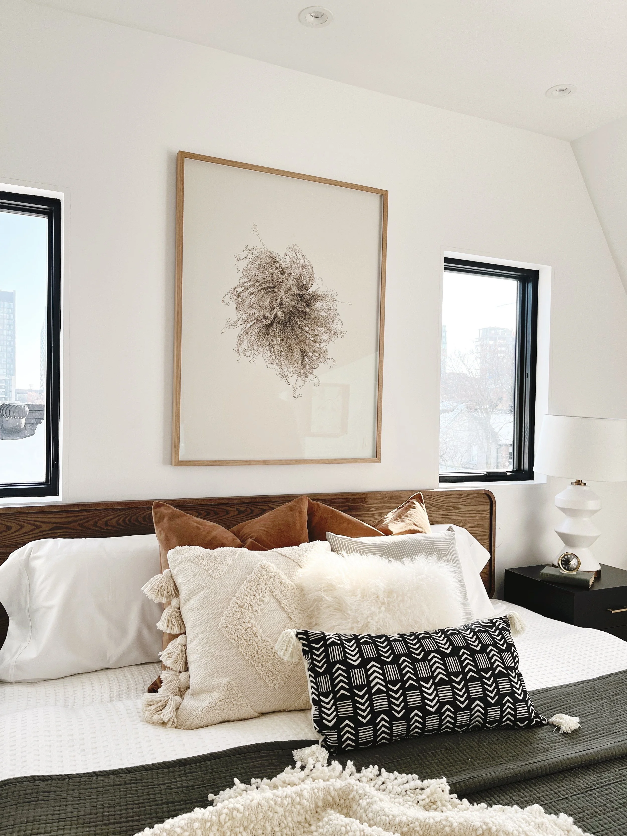
The bedroom is a retreat, a place for relaxation and it’s great to find artwork to reflect that. The best walls for art in the bedroom are directly over the bed (preferably landscape or multiple prints hung side by side to fill the area) or on the wall opposite the bed. Look for nature inspired pieces or abstract artworks with soothing tones. If you are into photography, landscapes or desaturated photos work wonderfully. Keep the frames minimal too. Here, we want to focus on the art piece itself and not so much its vessel.
Your Office / Home Office
Whether you work from home or in an office (these days the two are combined, aren’t they!), art is a great way to personalize your space and keep you inspired and be in good company. A gallery wall of framed heirlooms, such as your child’s first artwork, a page from a grandparents’s sketch book, love letters, travel or family photos are a great option for this space.
The bathroom
The bathroom is another room that often gets neglected with art. The artwork you choose should go with the vibe of the bathroom. For example, if it's a powder room on the main level, you should stick to more fun and bright pieces. If it's a master bath, go with more serene or calming pieces. Bathroom art looks great in pairs, we like to choose a set of two either stacked or side by side. They can be two of the same abstract pieces with one flipped on its side, or two different pieces that go with the same theme. Solid places for these pieces would be over the toilet, over the bathtub (if you're lucky enough to have one), anywhere you have blank wall space!
Hallways & Vestibules
Hallways & Vestibules are a lovely opportunity for an art reflection moment. And don’t forget mirrors in your search to fill your walls in these areas too! A well-placed mirror will reflect back the light, colour, shapes, and images of the room as well as being a practical thing, for a last minute looky up and down before you approach the front door.
TIP #7 - Surface moments
Displaying Art on a Shelf, Mantle, console etc. Bookshelves are great places to display smaller art pieces too! A Sculpture, black and whiteor vintage etching or print can break up the shelves from all the book spines and allow your eye to have a moment of pause, reflection and intrigue..

TIP #8 - Layering Art and objects together adds interest -
Be it candlesticks, a vase or a sculpture sitting on your mantle, layering such things in front of a leaning artwork creates a wonderful vignette or moment.
A picture ledge, shelf or console stacked with multiple leaning artworks of various sizes or a combination of interesting objects, adds extra interest to any space.
TIP #9 - Remember to also allow for negative space
Not every wall needs art. Just as the margin on a book page allows your eye room to rest and process, without overloading your brain, leaving blank space on some of the wall areas in your room will provide the same results.
The negative space highlights the art by pushing your eye towards the painting or print. It allows the art to be the focal point.
TIP #10 - Consideration of framing
Consistency with your frames is an impactful design element to see throughout your home. There are many aesthetic styles, from minimal, eclectic, bohemian to gilded. Try to mix styles that complement each other.
You can have them all in similar frames for a minimalist look or all different frames to add some character. These pieces can be rotated or updated whenever you get bored.
I touch on this in my framing blog here.
Most important of all, have fun dressing your walls and enjoy the process of choosing the art and connecting to the artist, if you have the opportunity!
Reach out to me for a complimentary art consultation via email annadaltonchurch@gmail.com or book online.
Anna ox