
Do you Blush too?
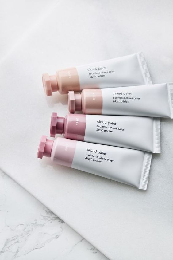
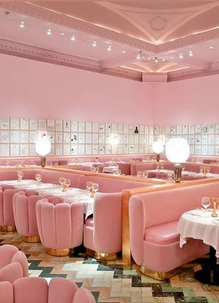
Pantone may have declared 2018 the year of Ultraviolet, but I’m going another way. We’ve seen beauty brand Glossier do wonders for it. And Sketch in London hosts the most irreverent traditional British tea in the shade too. ‘Millennial Pink’ had it’s moment, but as far as I’m concerned, a demographic cannot co-opt a colour! : )
For sure, there’s be no shortage of pale pinks thus far, but I don’t think the trend is going anywhere. The interior designers are taking it back!
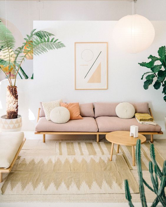
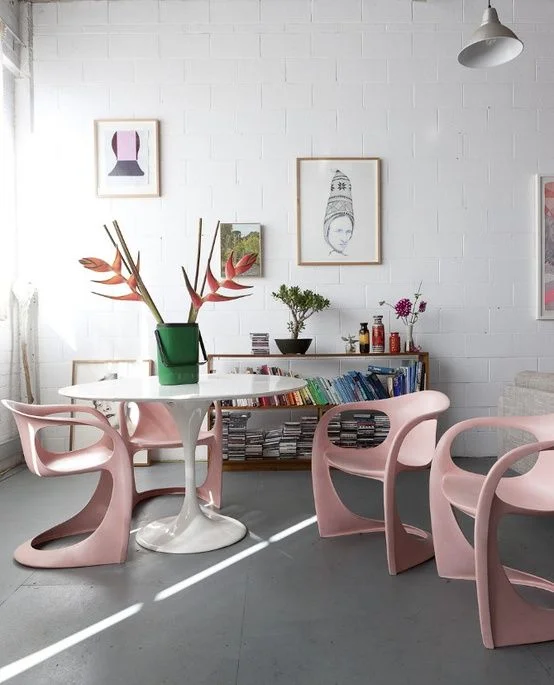
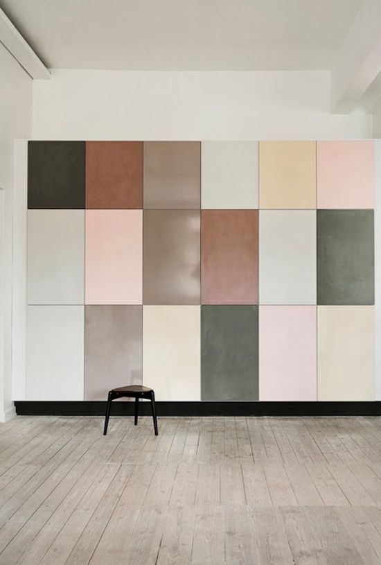
If you don’t know where to start your blush journey, I would recommend statement seating! Here are a few examples of the way the colour looks so successful within rooms that are also in pale hues.
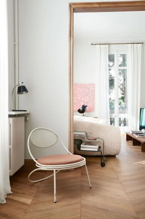
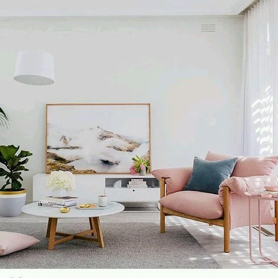
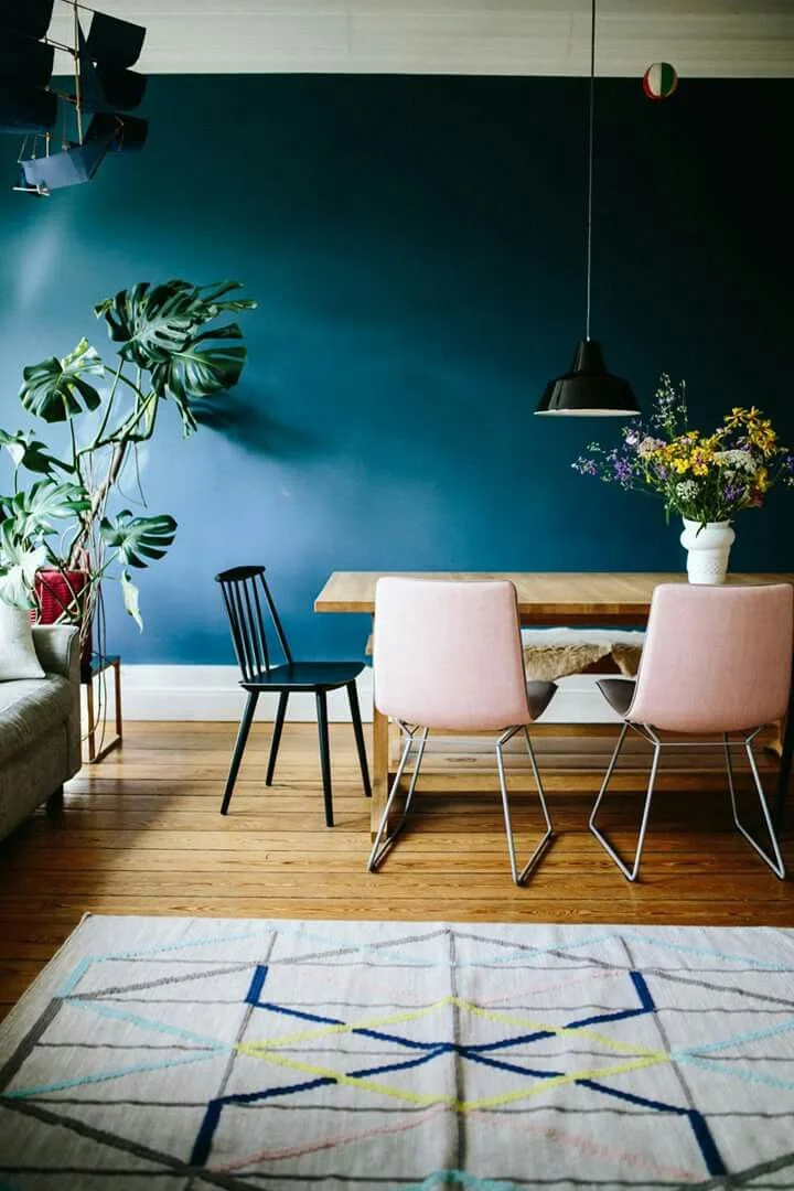
However, the pale pink really pops against contrasting interiors as well. In my opinion, an injection of blush really creates a soothing centre to a dynamic and vibrant space.
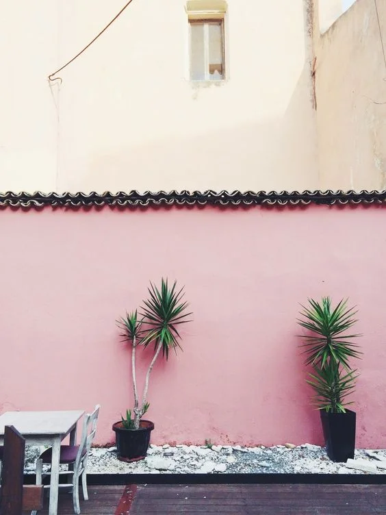
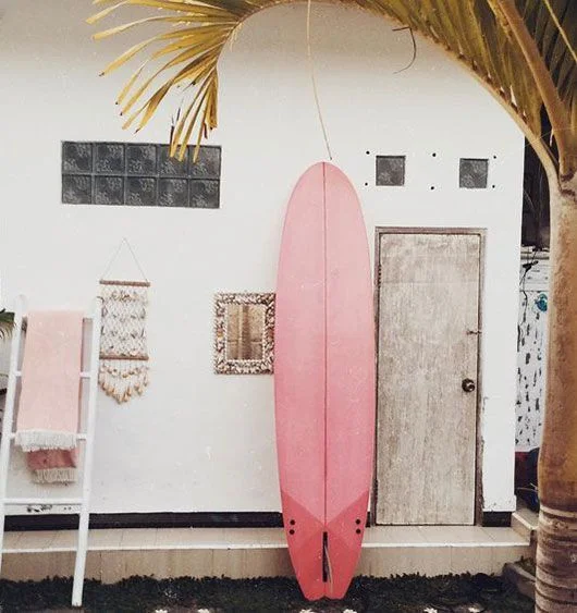
One thing to be aware of with blush seating however, is grubby little fingers and paws. Not only are many of these pieces finished in fabrics that can be a challenge to keep pristine (such as velvet), little hands and animals may not contribute to the cleanliness. If that’s the case in your home, consider taking your pale feature outdoors. The patina of the pink looks really lovely in all locations and seasons. Consider painting a statement wall, or adding in an accessory to capture the blush vibe.
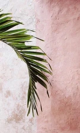
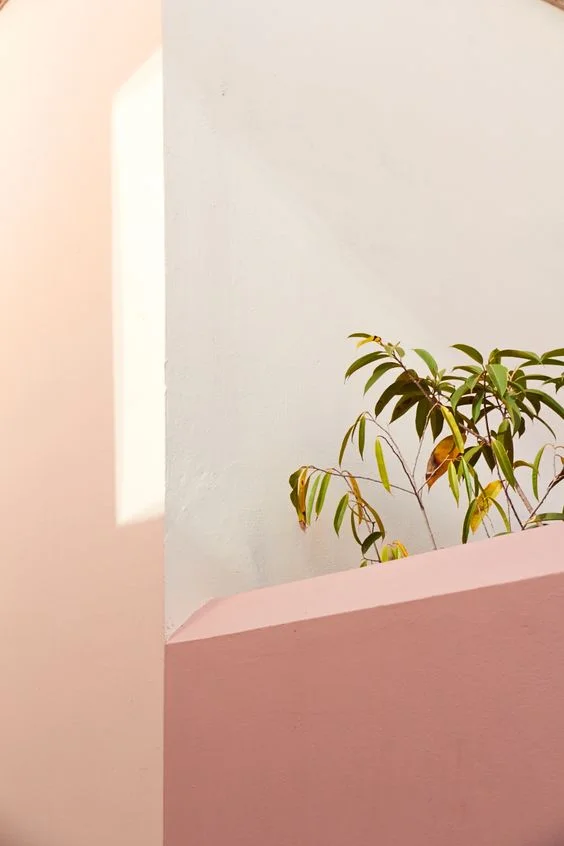
You may have also noticed how beautiful blush looks next to greenery, and as you know, I’m always looking to incorporate more plants, a mandate of my interior environmentalist designs.
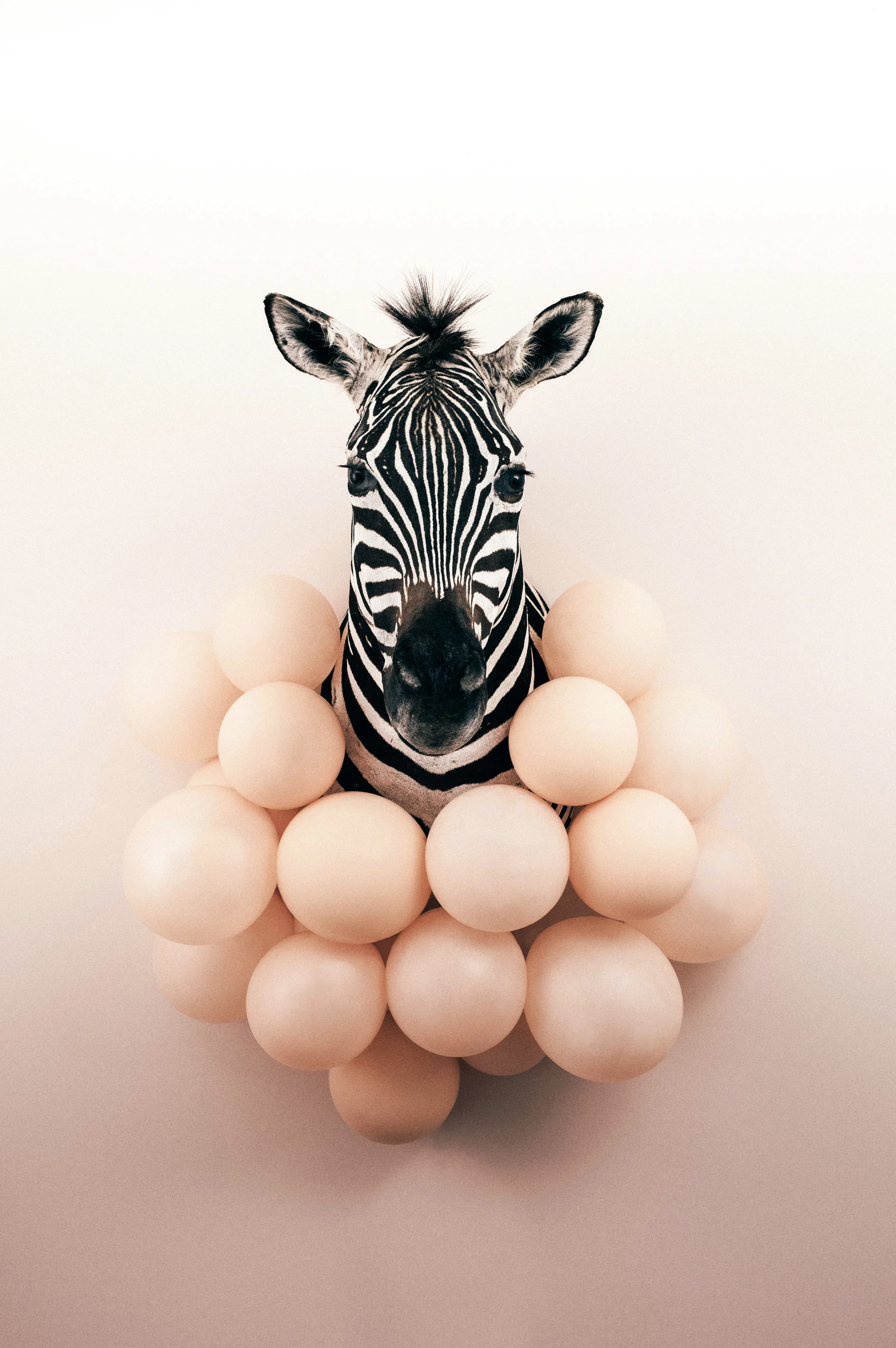
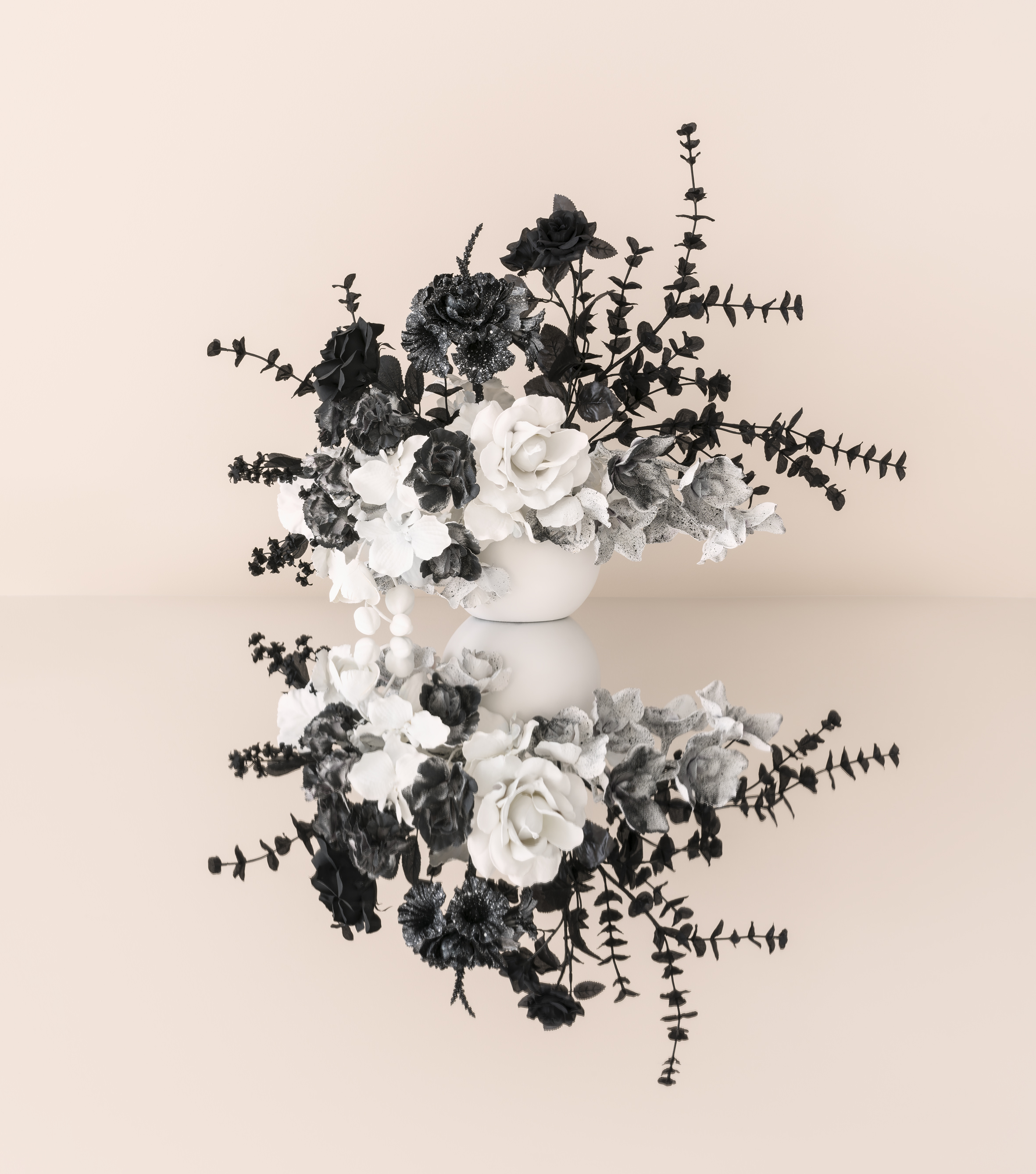
And of course, if you need coordinating blush artwork, I have your bases covered for that too!
Happy holidays! See you in 2018!
Anna ox
All image sources can be found via my Pinterest Board 'Pastels'