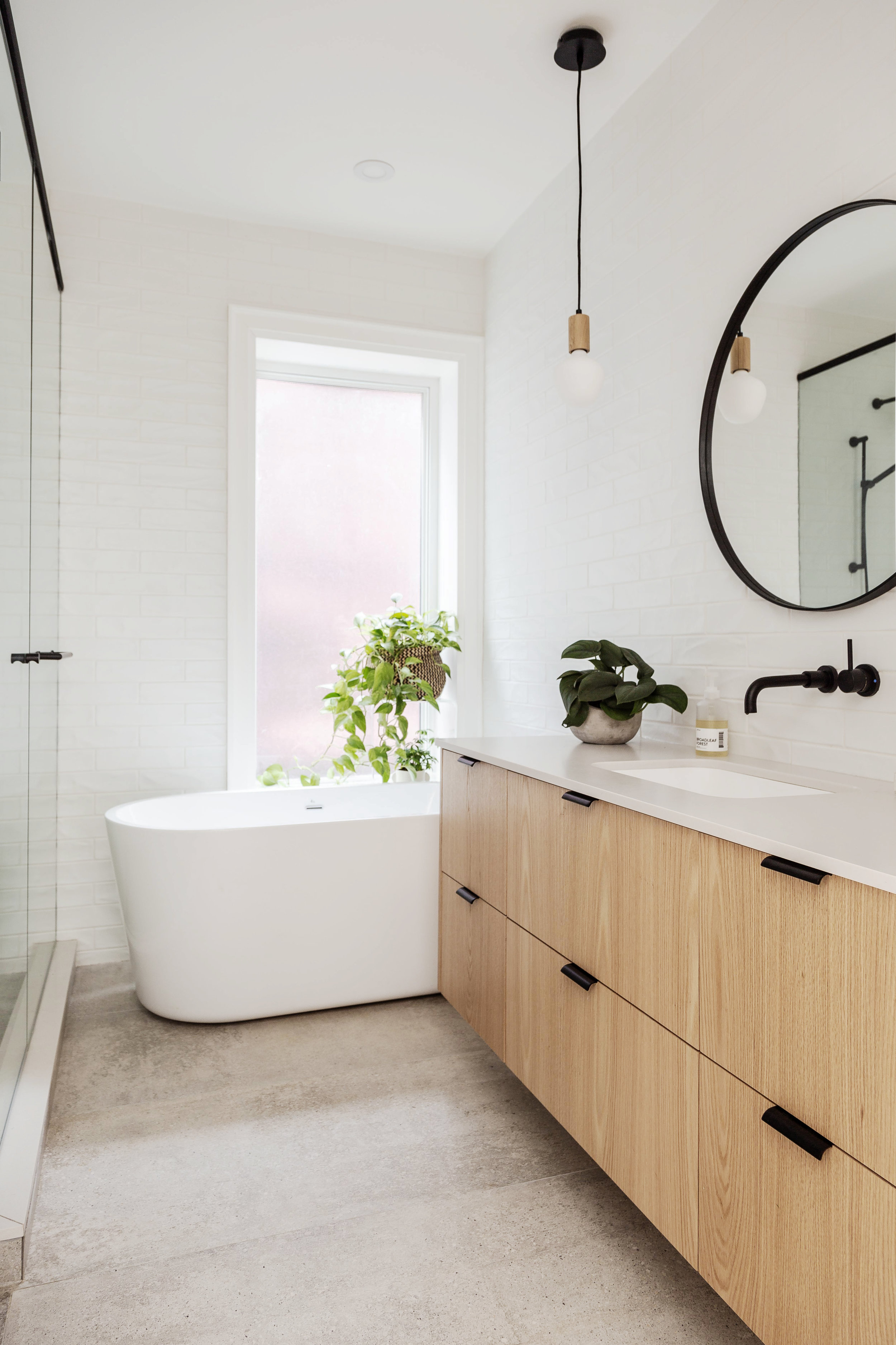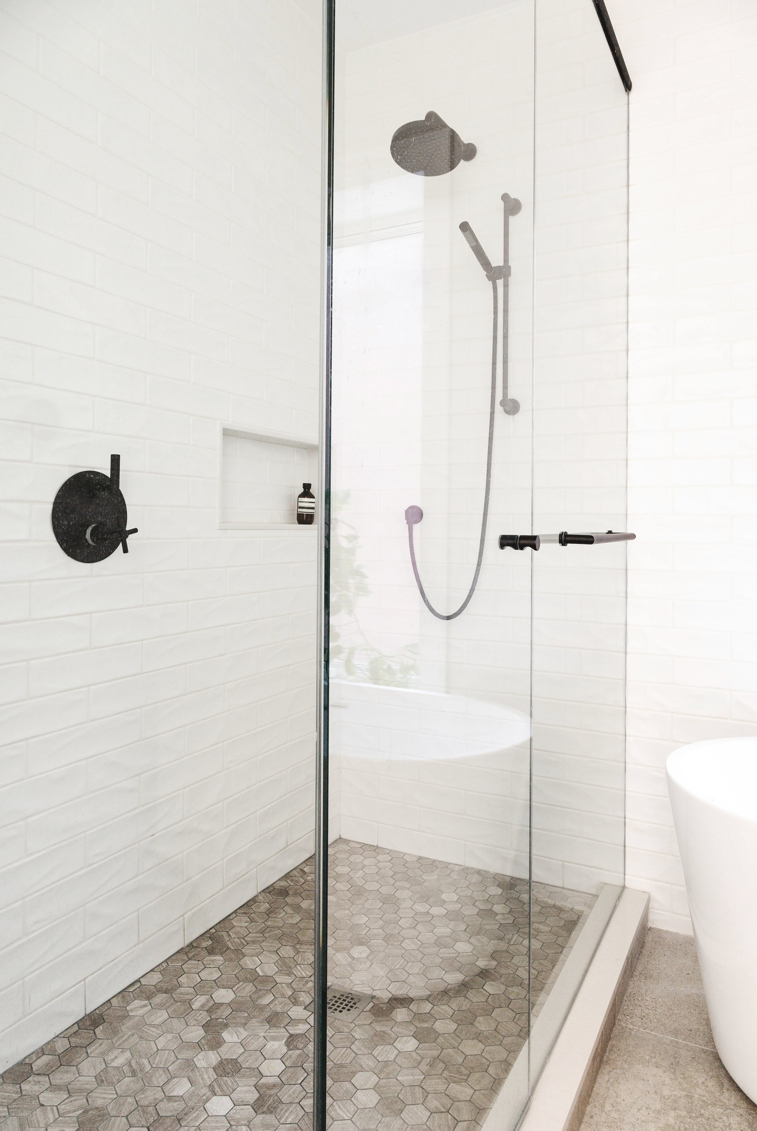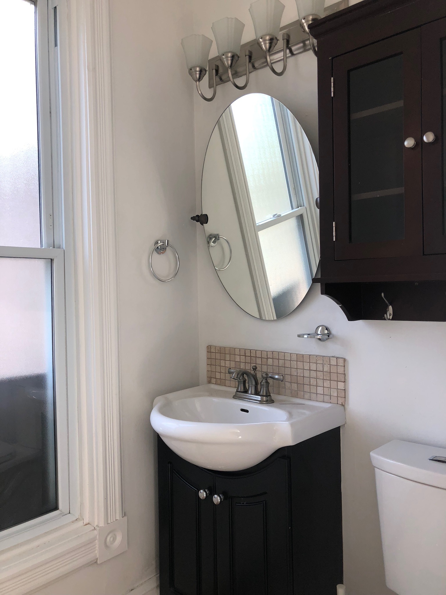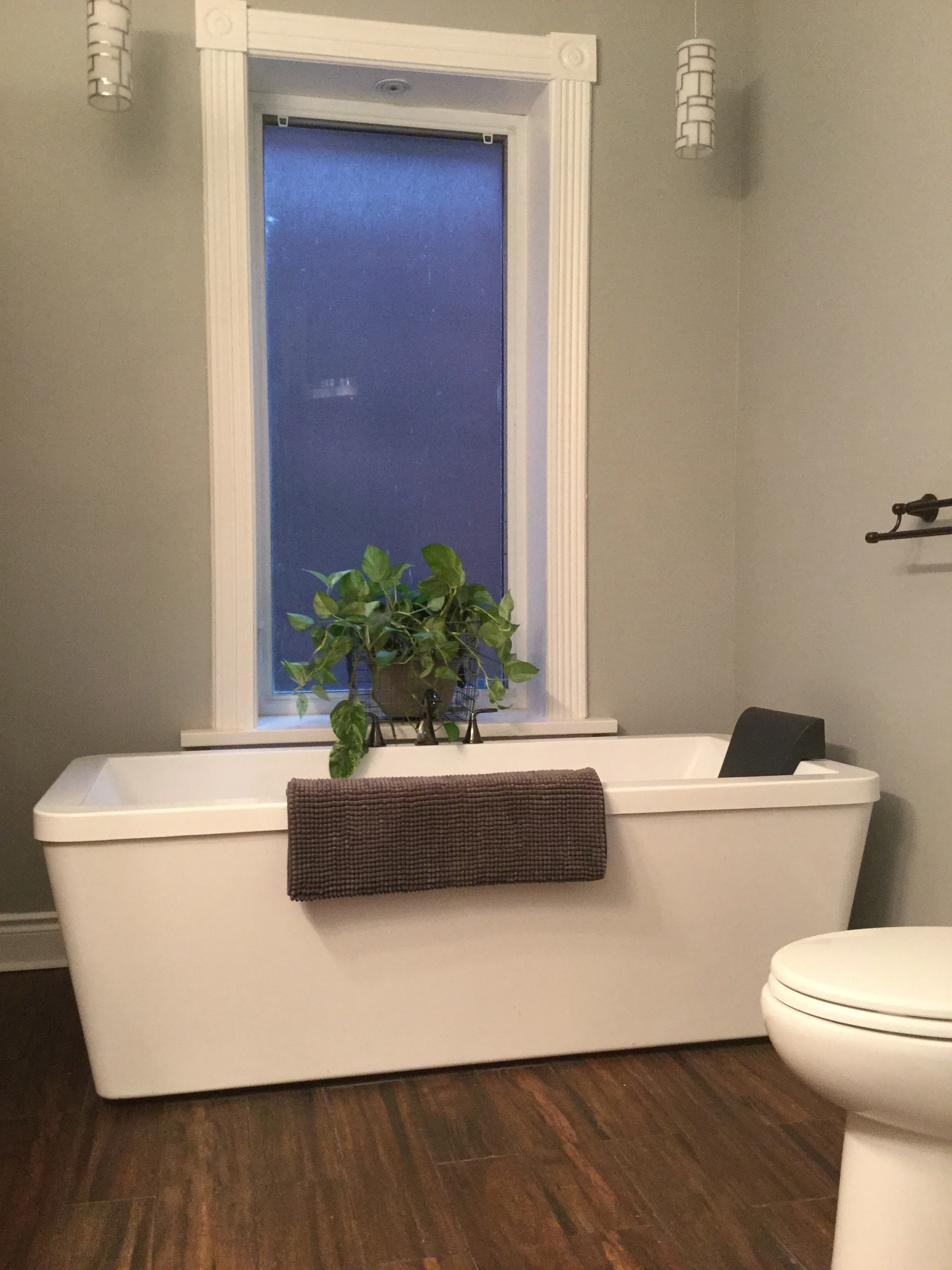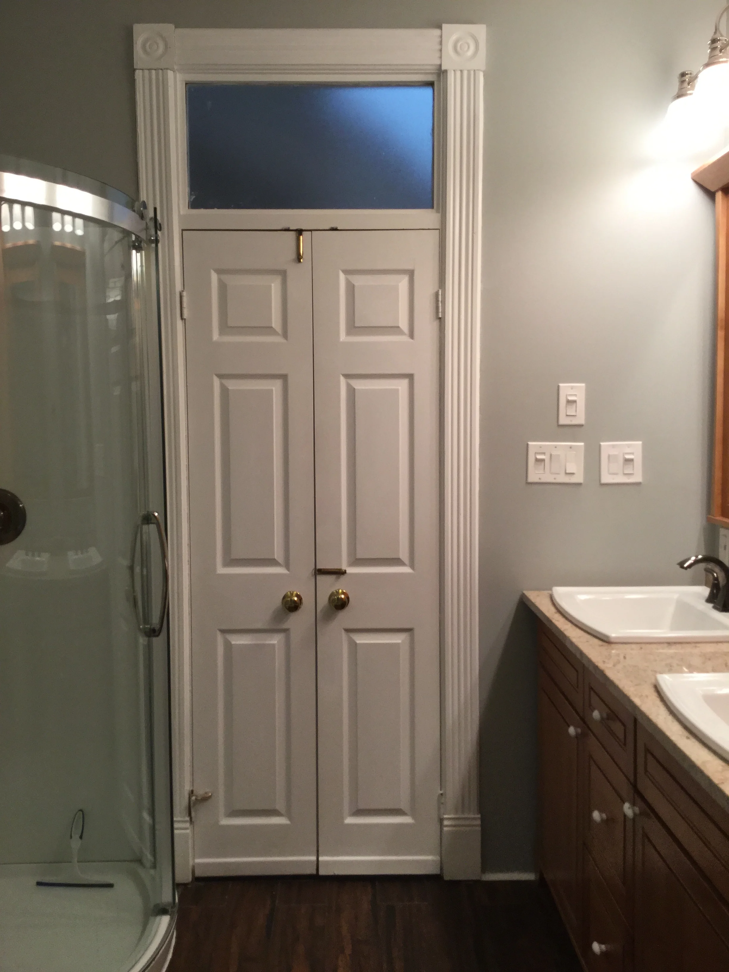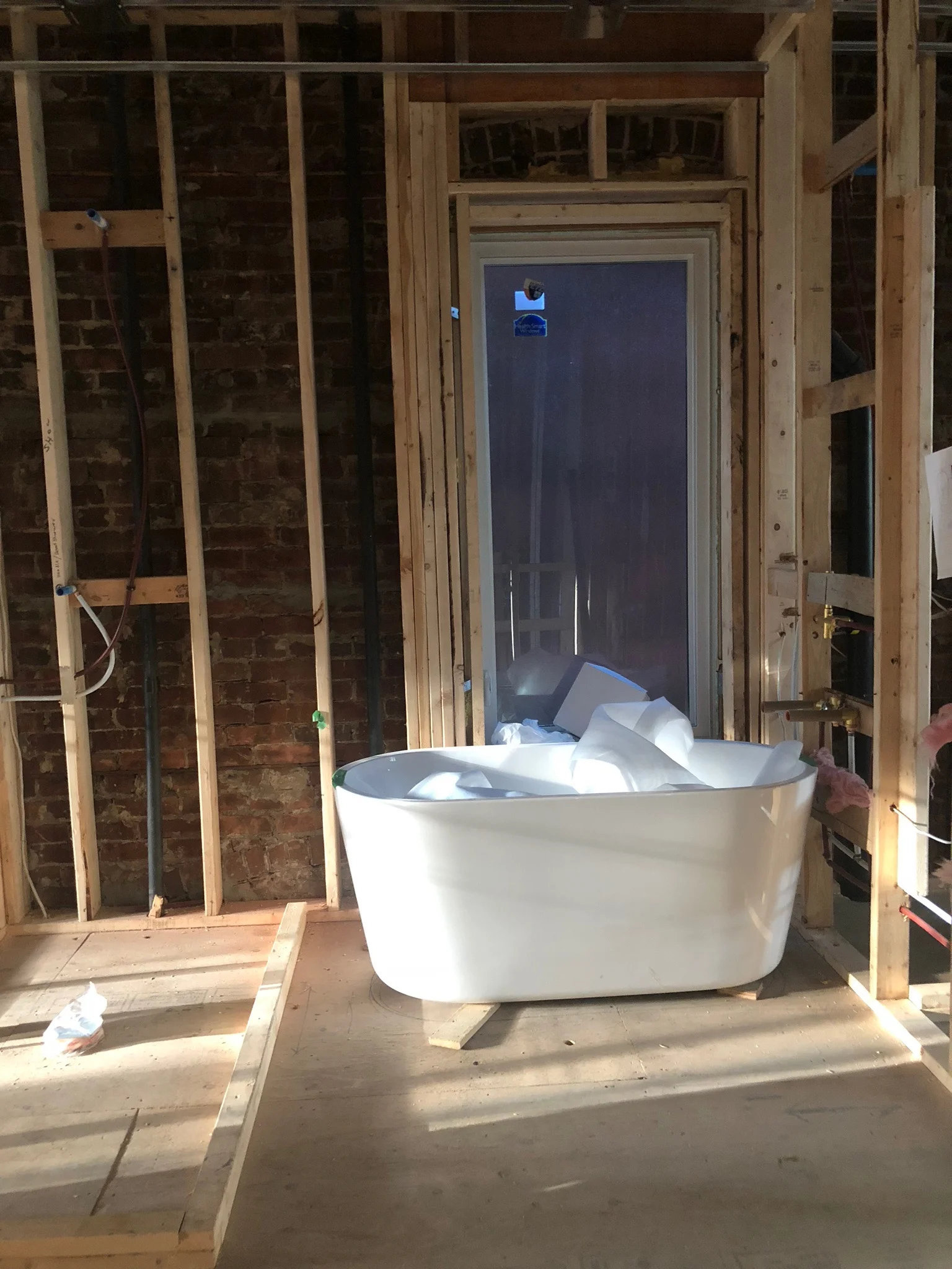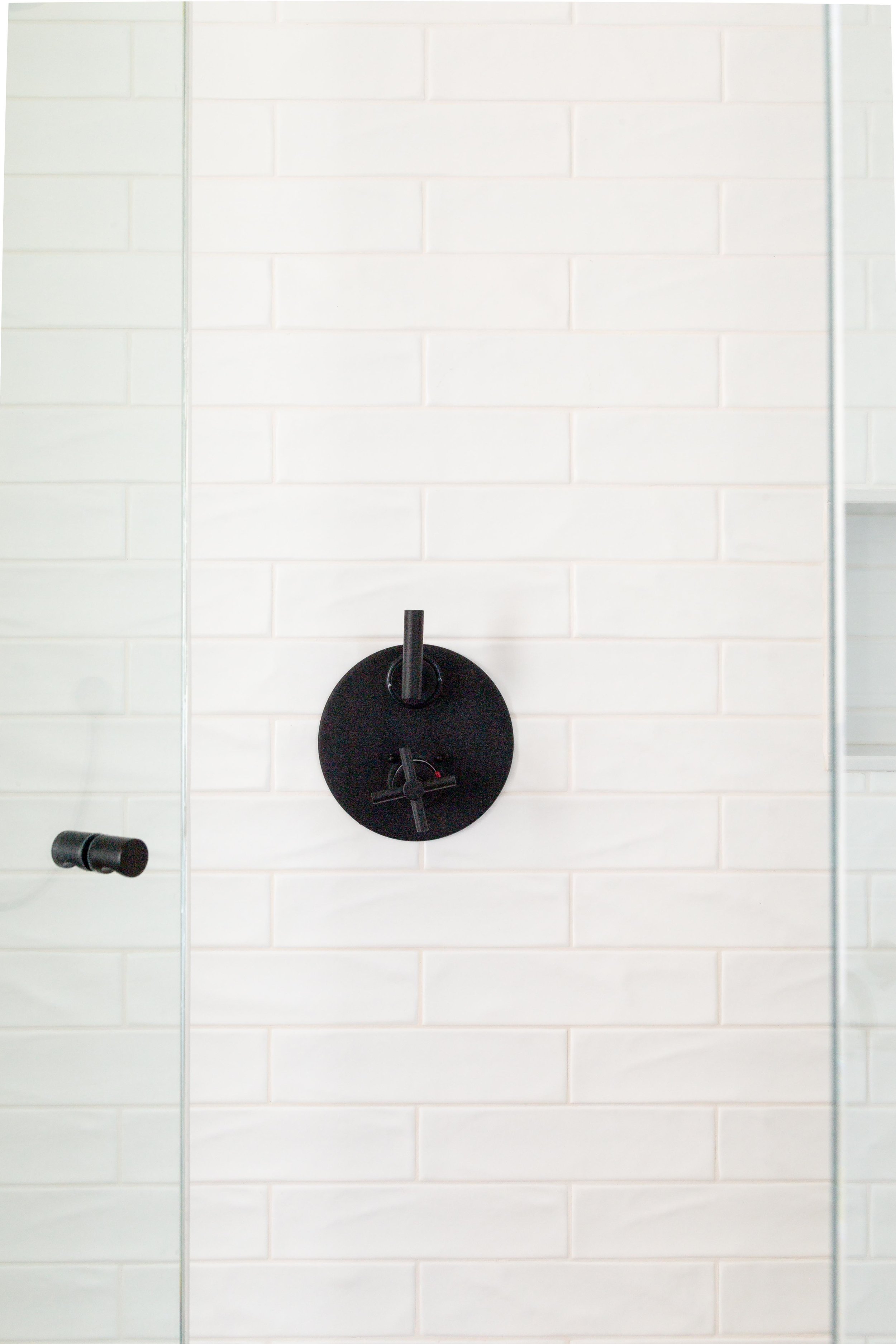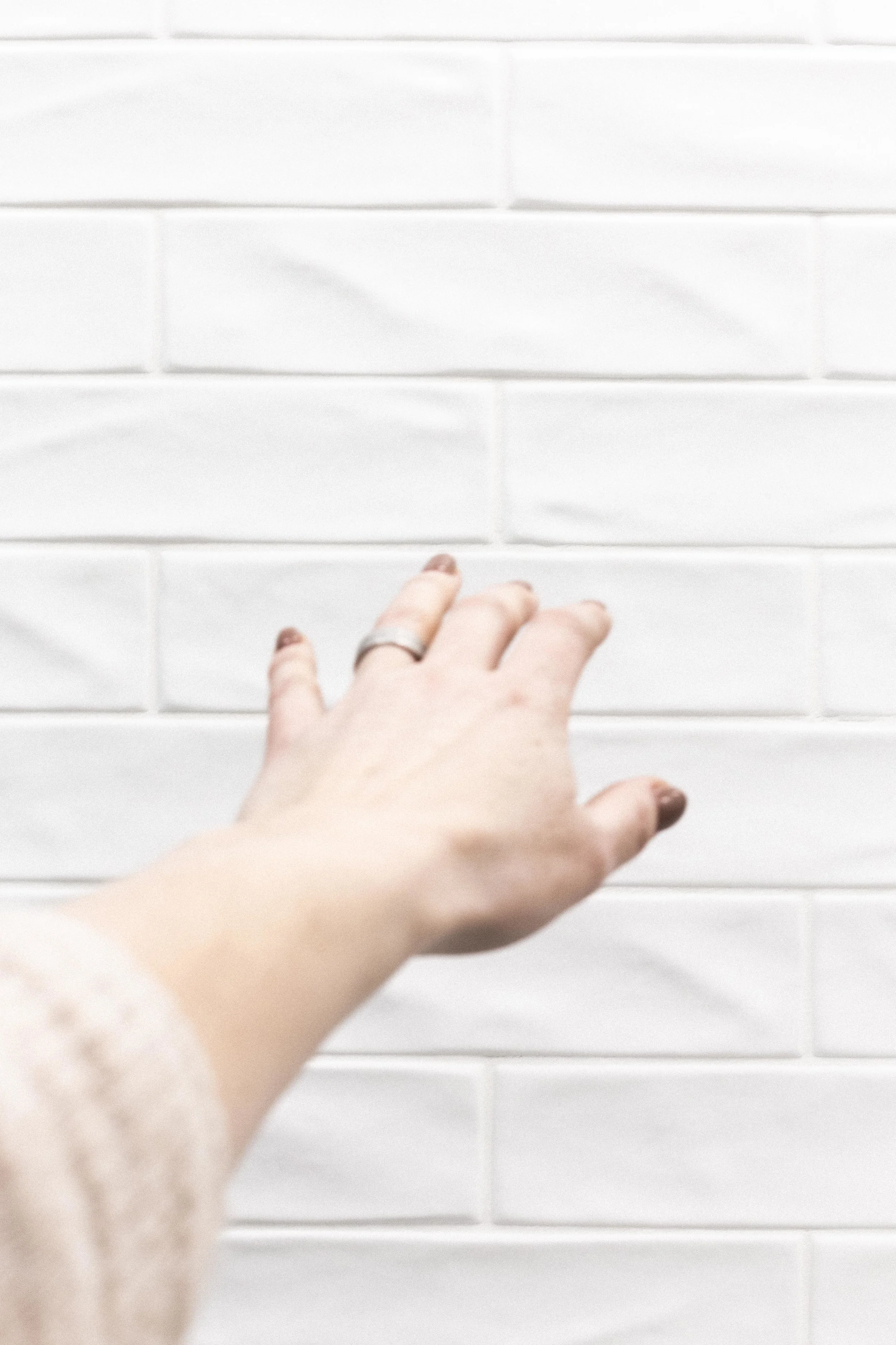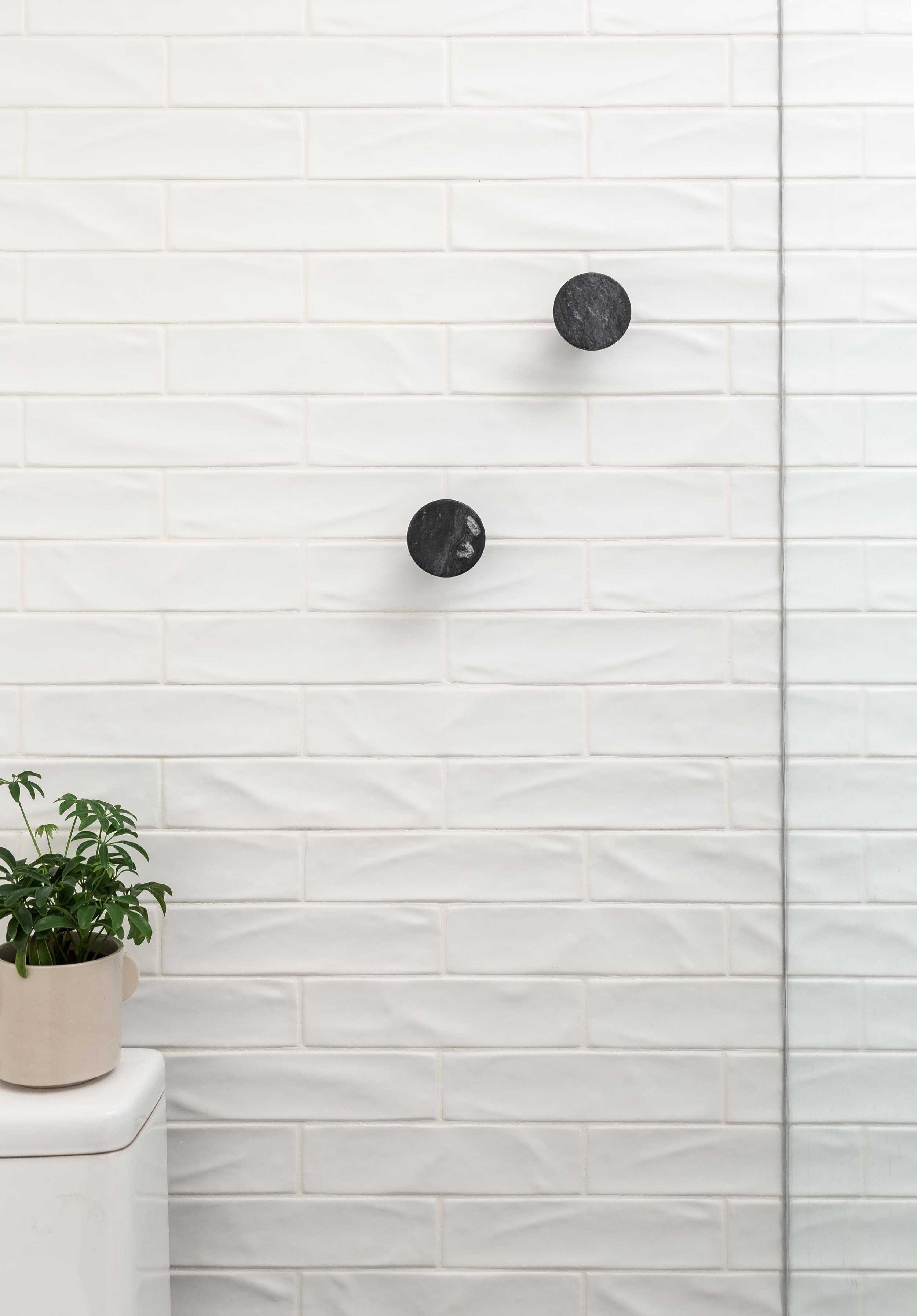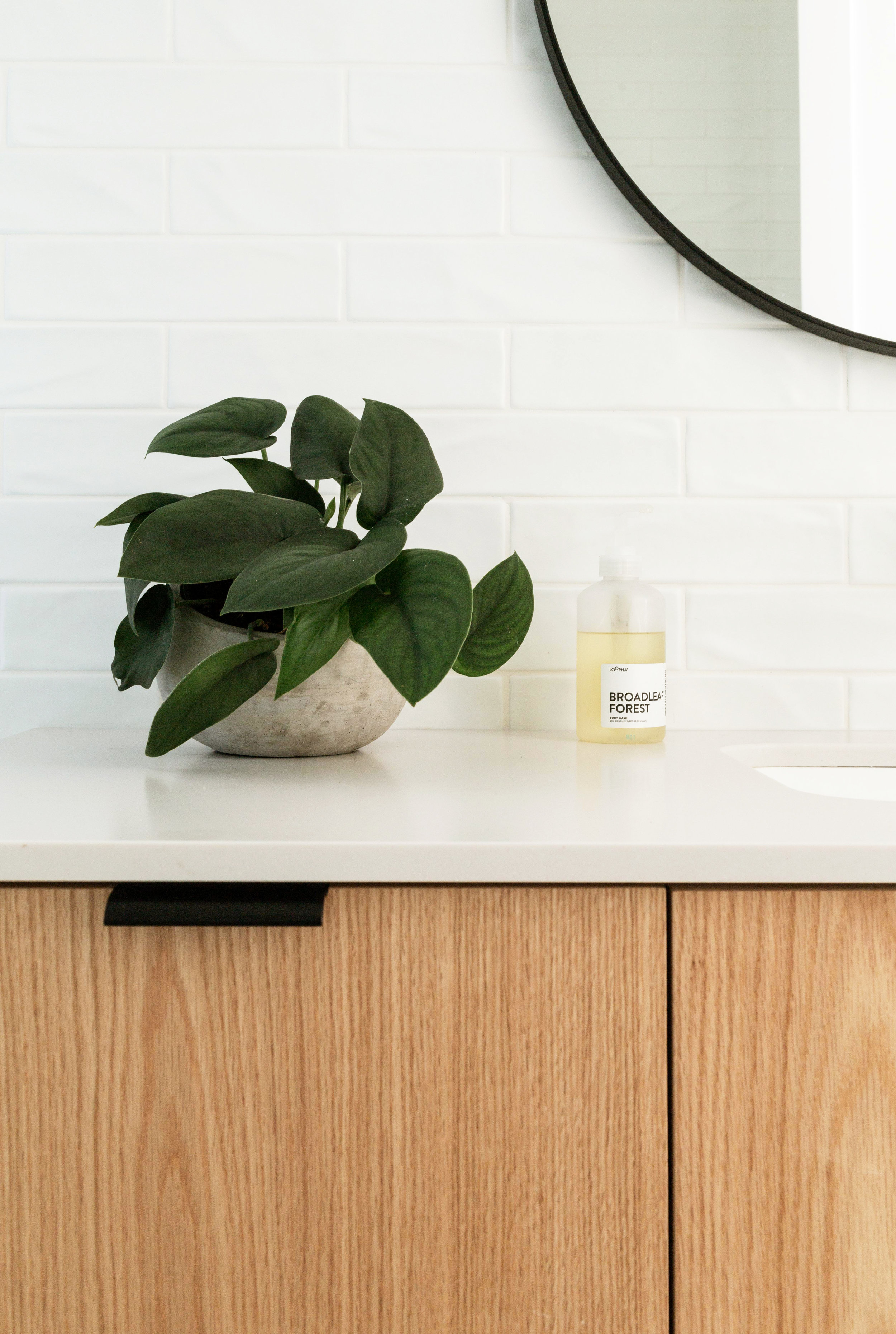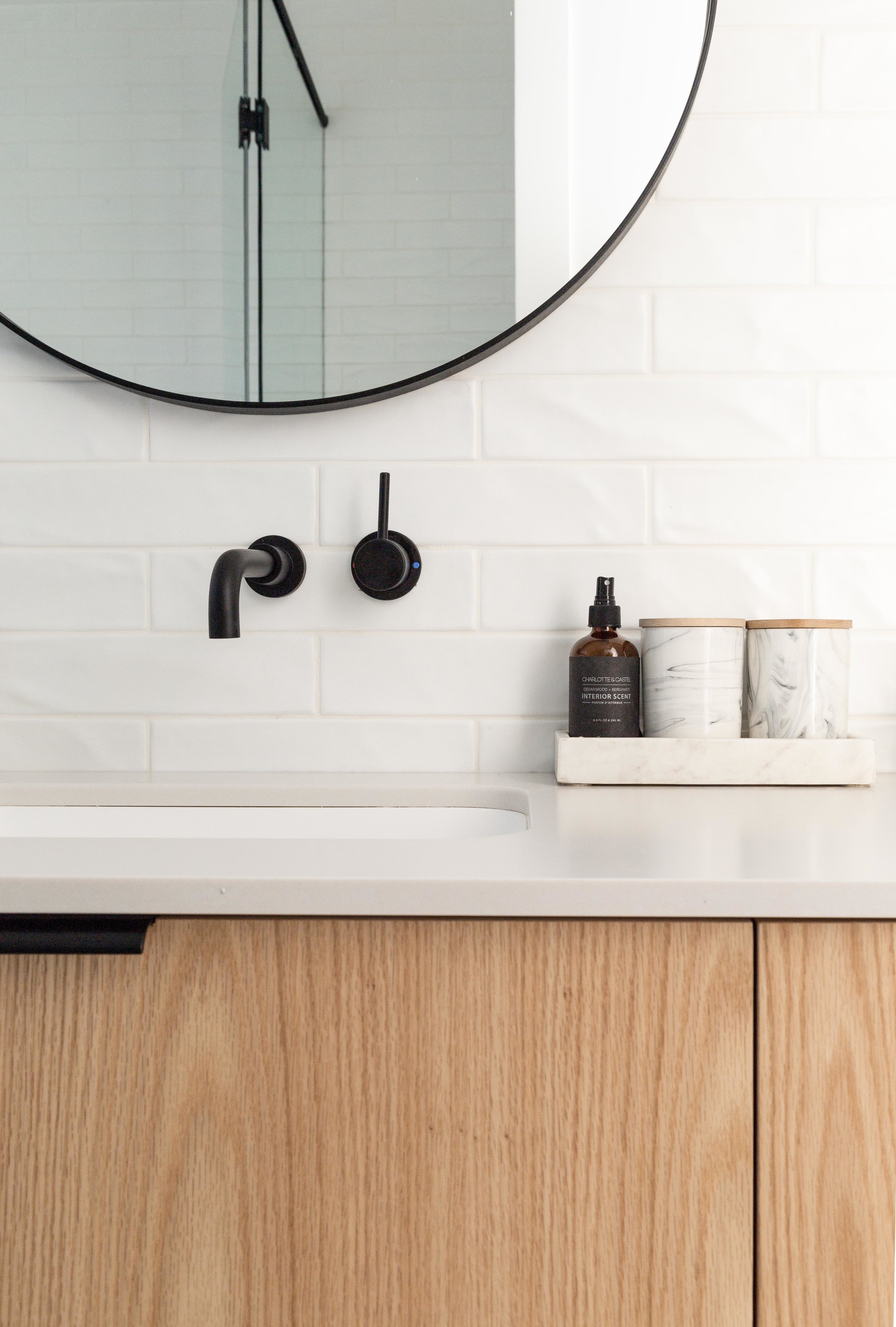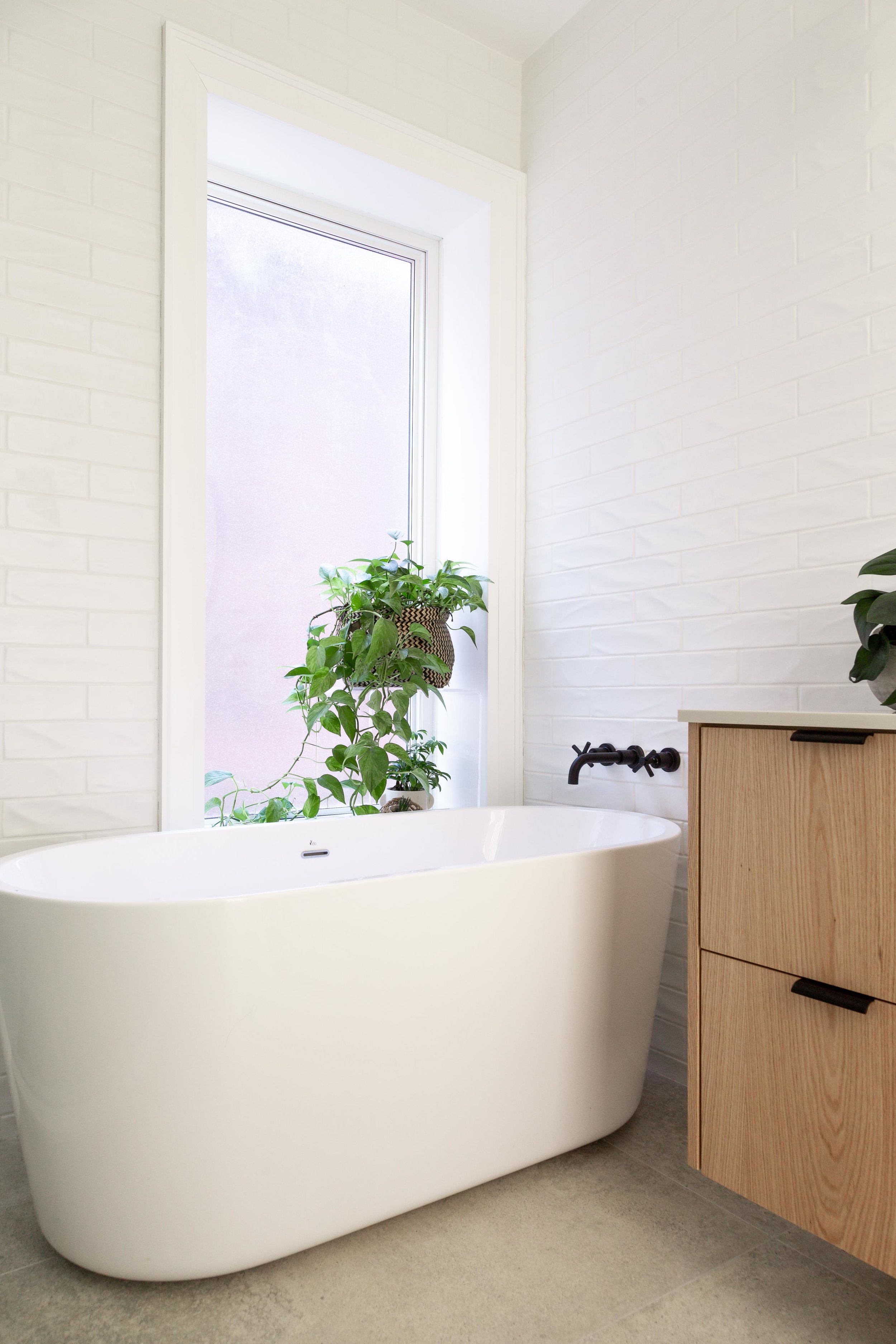
Despite being a room, perhaps more than any other, where functionality trumps design, your bathroom does not need to forgo exciting and interesting design touches. In fact, I used my bathroom – or bathrooms (x3) to be exact – to make a consistent design statement in our renovated restoration home.
When starting the bathroom project in particular, I went to one of my icons and did a little research. Here is Ilse Crawford, in her own words_
We want to prioritize the unmeasurable stuff_ things like atmosphere, tactility, beauty and comfort. These qualities slow you down; they really embed your body in a place. We’re tactile, sensorial, emotional beings, so it’s important that we’re living—properly living—in a space and not dashing through our days.
(From Kinfolk Issue 18). Her theory rang especially true when it came to making selections for the bathroom, a room all about the body! Who hasn’t pondered a problem while washing their hair? Or found some perspective in these rooms that boast more mirrors than anywhere else in the house? Also, it’s a space that personifies the very nature of tactile interactions_ running water, soft towels, scented lotions; those are bathroom experiences.
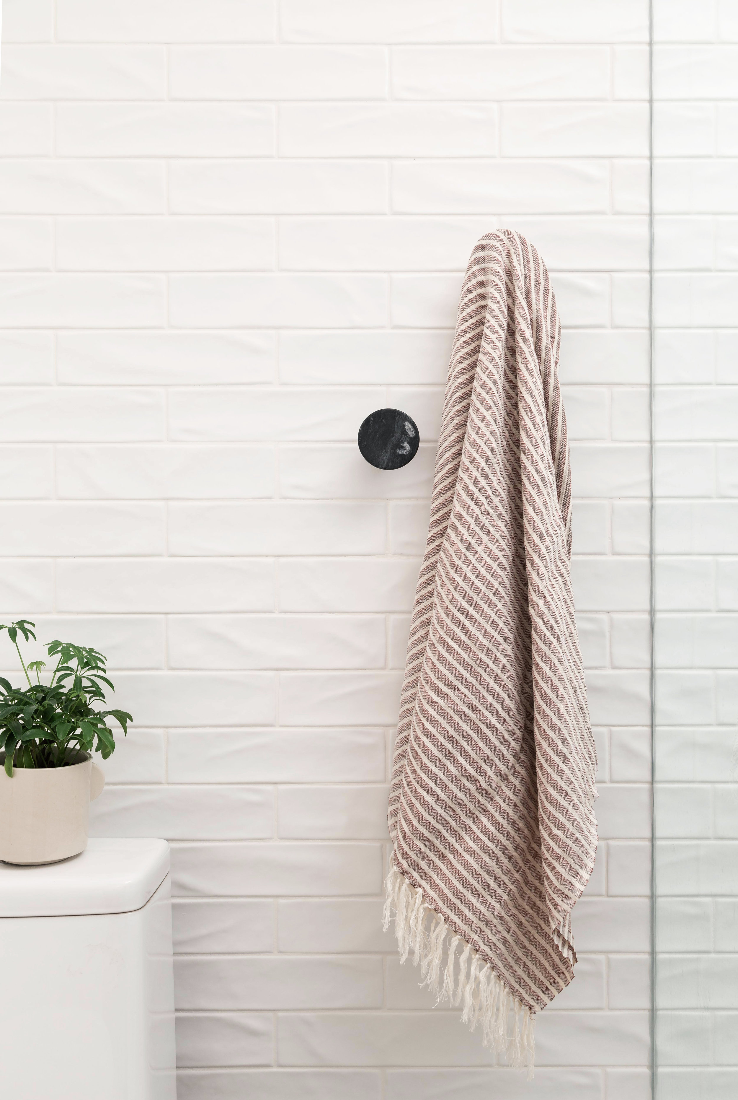
So I had a lot of theoretical inspiration but the more I searched for finishes and fixtures, I remained uninspired. A lot of the elements felt flat and sterile to me. And that’s when I found that piece that wove everything together; a three dimensional ceramic subway tile.
With this one detail, I not only found an answer to the fluidity and tactile nature I was craving, I developed a strategy to create a prolonged sensory experience throughout the house. Because I did not reinvent the wheel with each bathroom; each received the same treatment, creating a literal and figurative fluidity as you move through the various floors and rooms in our home.
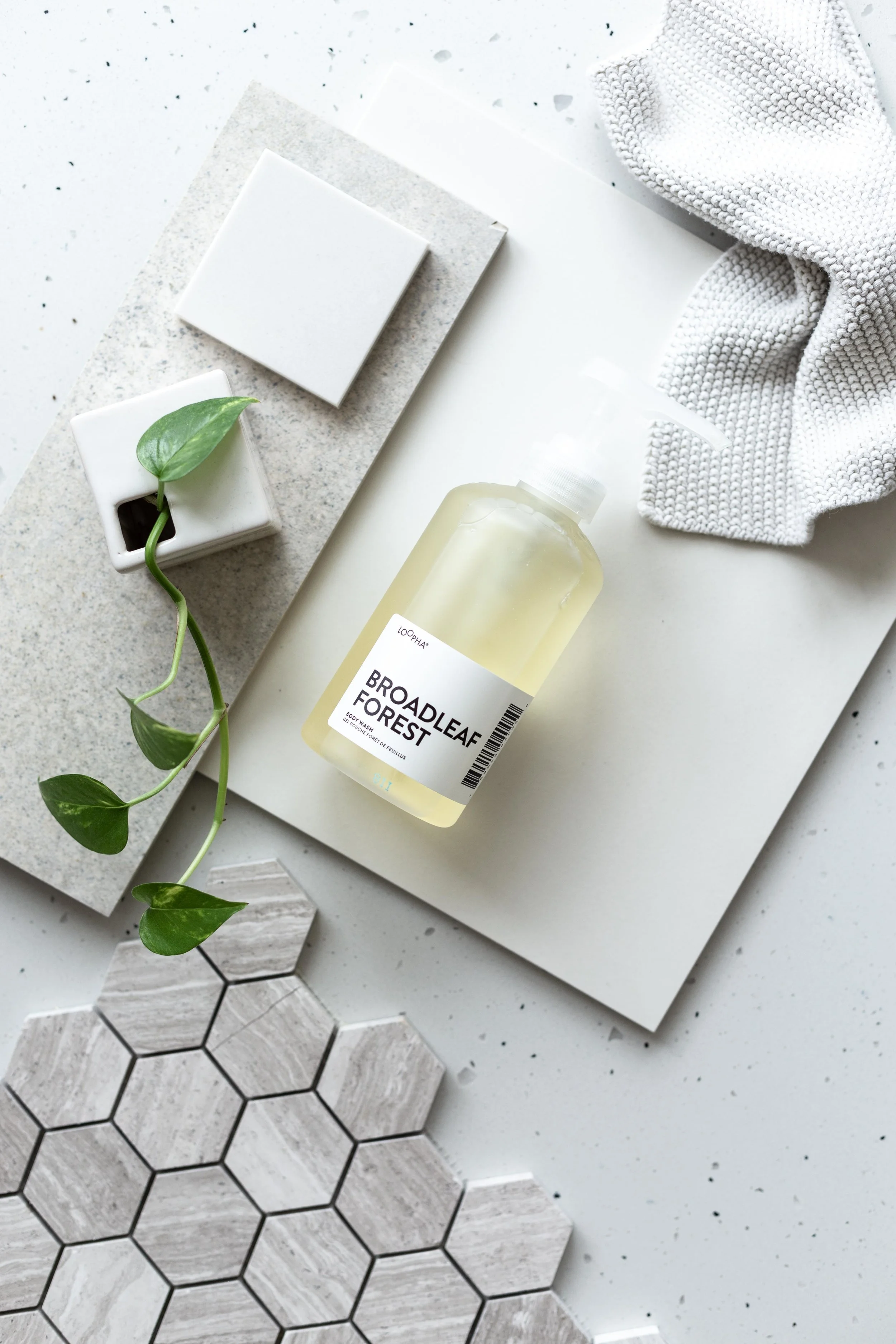
The tile itself was inexpensive, allowing me to to use it from floor to ceiling. Its organic shape offered a variety of experiences based on the way the light hit it. And using this design detail as my through-thread adhered to Ilse’s mantra about the visual plus the tactile. Using the same finishes in all the bathrooms in the house shows not just consistency but confidence as well, both signs of good design. It allows for a uniform experience and the bathroom is a space uniquely suited to this coherent approach.
Once I had my cornerstone design element, the rest fell into place.
Obviously, being able to achieve this consistent bathroom approach might be relegated to a new-build or a complete renovation, like mine. But, if you find yourself working on a bathroom, you can always match it to one you’ve already done before! Or, if nothing else, I hope this offers an approach to take (which can be applied to any space, room or project) about inspiration_ start with some wise words, a source of design inspiration and one unique element. And then build from there!
See you soon!
xo Anna
Wondering where all the lovely fixtures and fittings cam from?
Faucets by Rubinet
Marble Wall hooks by EQ3
Hanging Pendant lights by EQ3
Round Mirror - IKEA


