There’s an inevitably when it comes to home entertaining_ that everyone will end up in the kitchen, AKA ‘The Heart of the Home’.
This charming reality was always present in my mind when undergoing our own kitchen renovation. While the project included the whole house, creating the perfect kitchen to gather in represented a huge portion of the new building’s feel and flow. Not to mention, I wanted to consider each surface, how it worked within the context of space and how it would thread a seamless flow throughout our house.
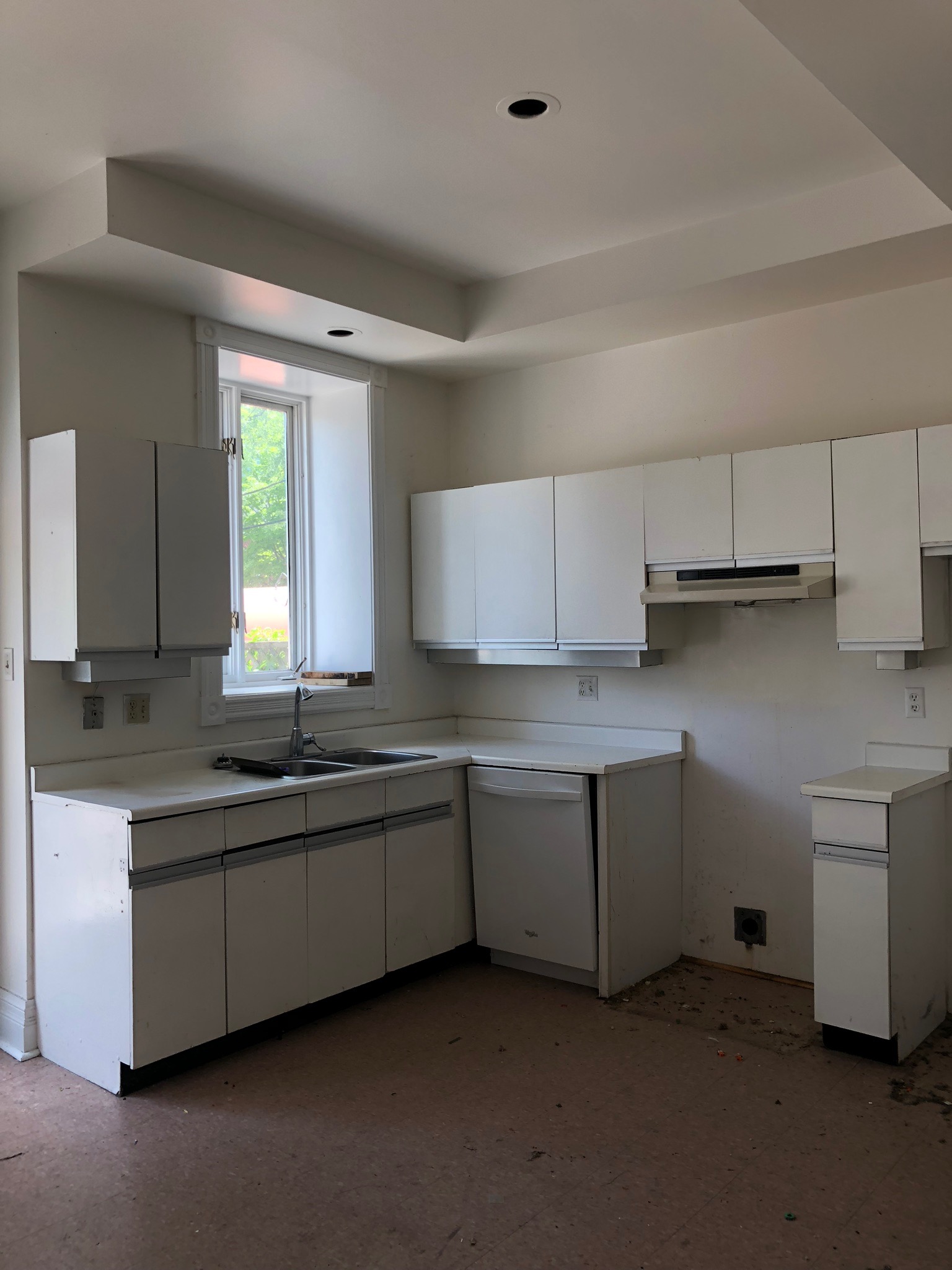
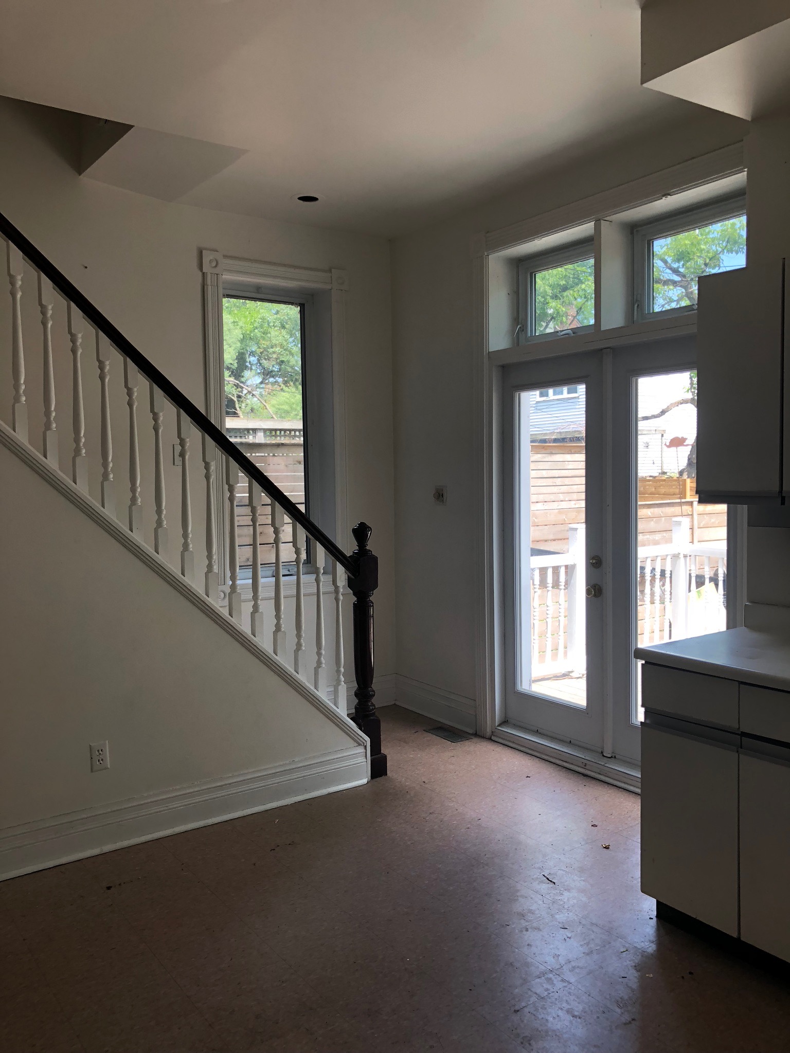
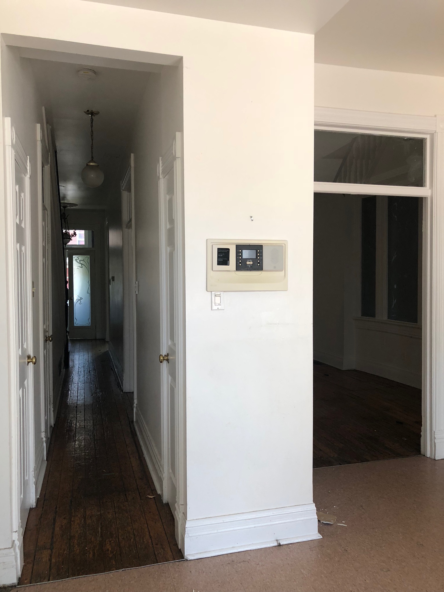
BEFORE …
The old kitchen was created in the late 70's, so while there was nothing redeeming or of sentimental value to give up there, it was hard to say goodbye to the original staircase, window casements and crown mouldings. Luckily, a historic house renovation site in the U.S and a moulding supplier in Toronto allowed me to source and reintroduce all these elements into my design.
AFTER …
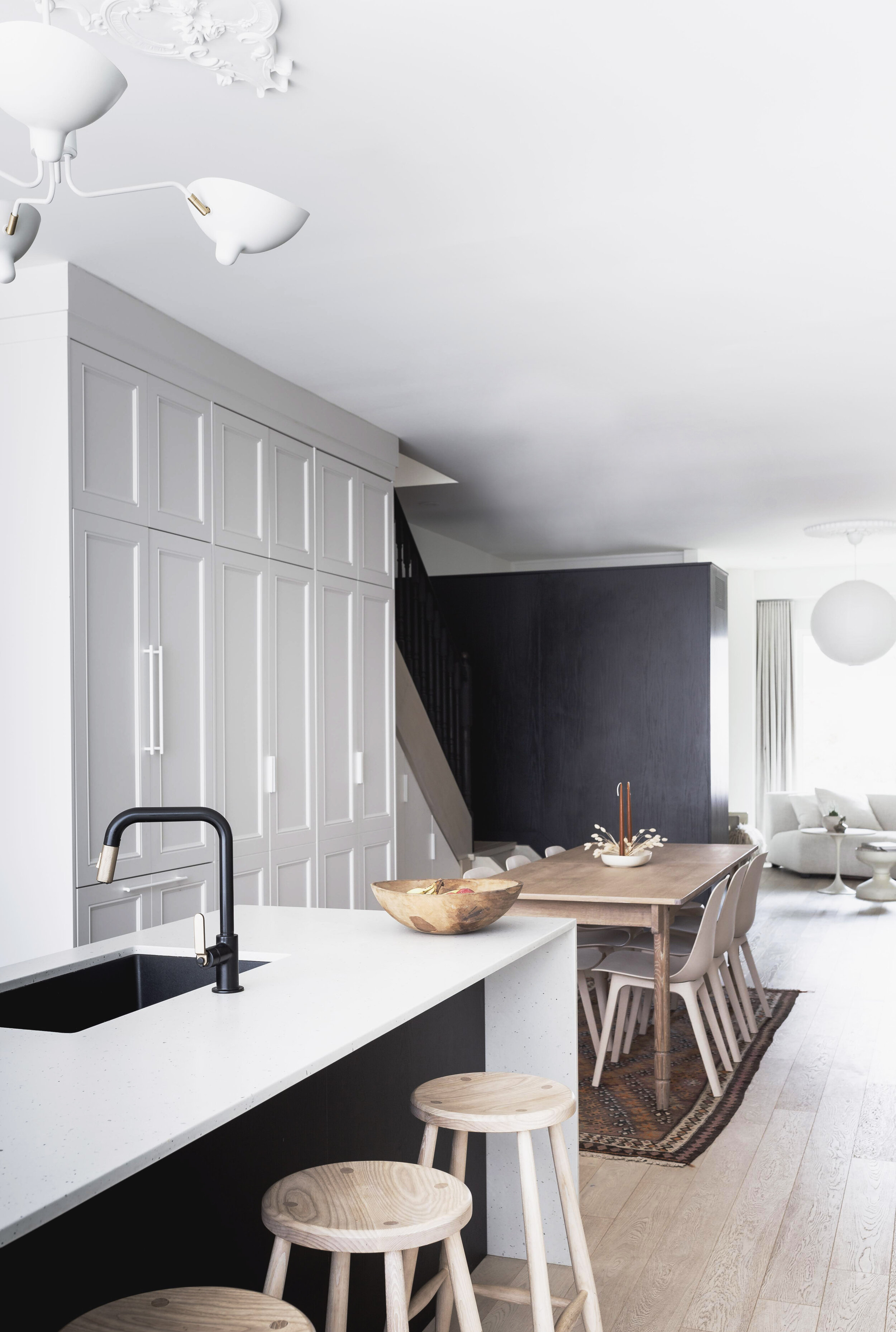
Our monochromatic kitchen
Many of the choices and materials, as well as their execution came from consciously being aware of how we lived and operated in the old space. Thinking about how we could vastly improve the first floor dynamic, rather than making reno decisions purely from an aesthetic point of view has made this new house function beautifully. We utilize the entire footprint, there are no dead zones anymore!
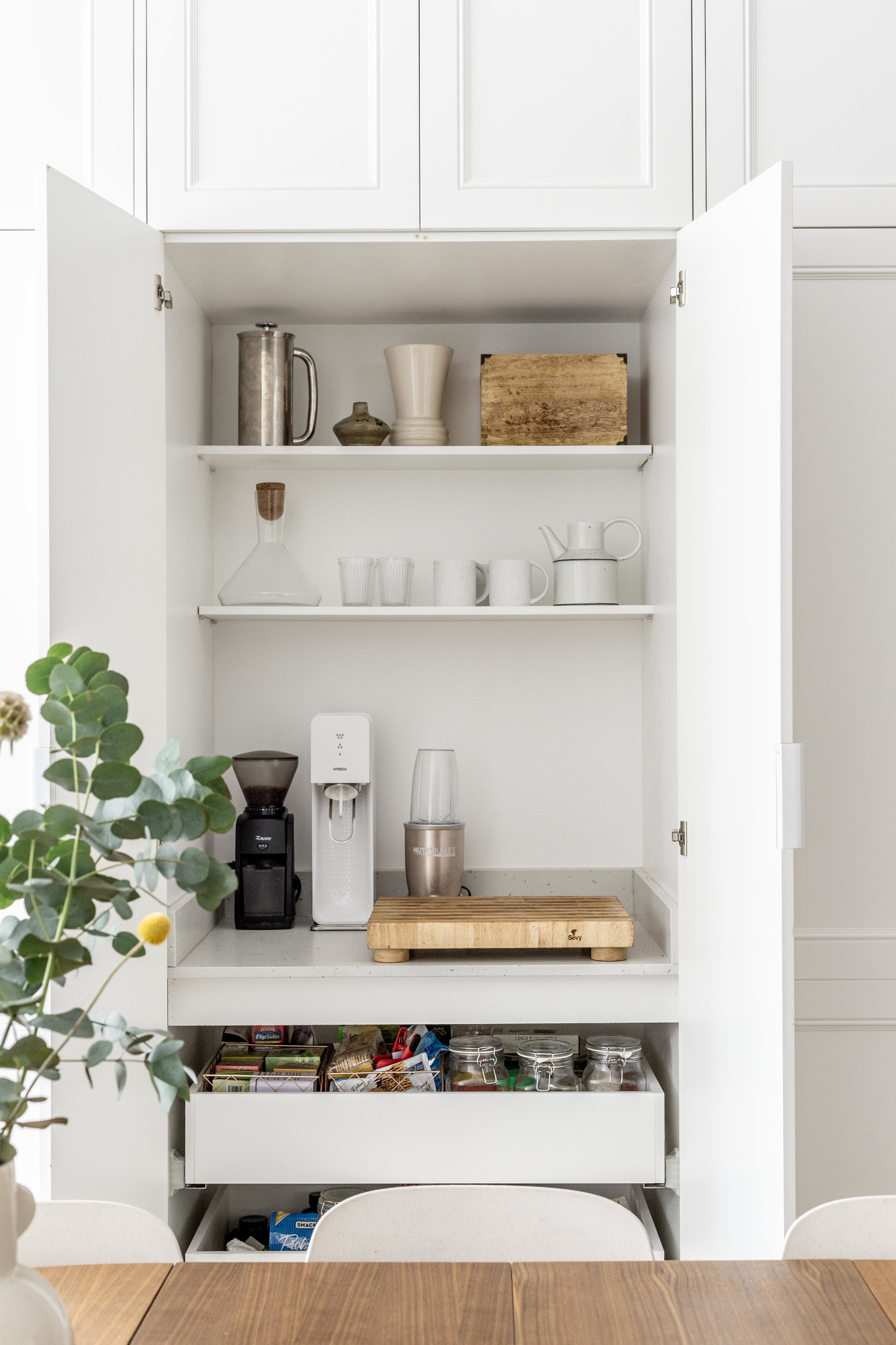
That same juxtaposition of old and new can be seen with the modern drawers and surfaces against the traditional carpentry that hide the fridge, food and butler’s pantry. This paneled wall is not only unobstructive but truly functional. Hidden behind is a myriad of kitchen equipment that one doesn't want cluttering their counter top! Furnishing it with a mix of vintage finds and new bespoke pieces, (i.e a dining Table from Guff, chairs from IKEA, custom made daybed and high stools by Atelier Arking ) pulled it together with a sense of modern nostalgia.
Traditional carpentry hide the fridge, food and butler’s pantry
Function and flow were considerations when choosing our colour pallette as well. Ecru. Pale smoke. Seashell. Hints of Burnt Clay, Dirty Pink and Green (mostly from plant life). These colours allow for an interchangeable layering platform. It will allow me to introduce new interior design trends and elements easily, and it is always nice to have the opportunity to allow yourself to dabble in interior trends!
I didn't want there to be too many elements competing for attention. Simple, functional, elegant yet casual was the brief I set. The kitchen countertops and backsplash feature a subtle concrete terrazzo look, thanks to Caesar Stone's Frozen Terra. I went with black cabinetry, but needed to oppose it as an achromatic colour. I selected a grainy wood with plenty of character and stained it (instead of a flat painted powder coat finish) and chose light coloured floors to reflect the light outward. The contrasting colours work beautifully against the warm, bright white walls.
Since moving in, the kitchen has become the heart of the household just as we knew it would. The great payoff of incorporating thoughtful, functional design flows through to the backyard. The large sliding doors from the kitchen at the rear of the house, adds even more function of this zone. Outdoor / indoor entertaining feels effortless!
This shelf applies itself to hold my artwork, my favourite ceramic vessels and foraged finds.
Backyard living zone
Artwork diptych - Blurred Lines Limited Edition Fine Art Print series, created in 2017
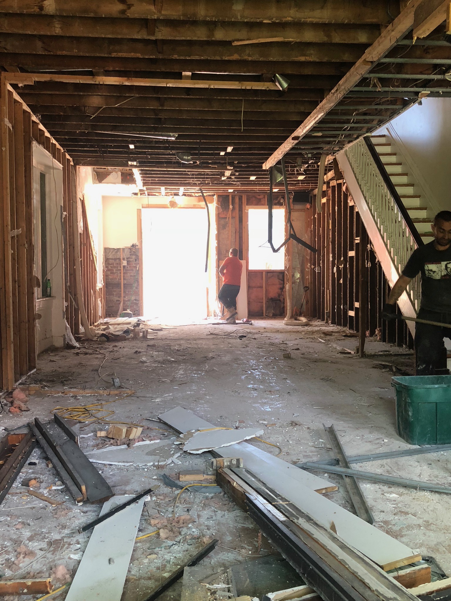
It was a huge undertaking and just the beginning of what would essentially become a full house remodel and through the process set the tone for the rest of the house’s finishes and vibe.
We love our new kitchen / main entertaining (plus Pandemic homeschooling space). And we look forward to many more memories being experienced in it!

